
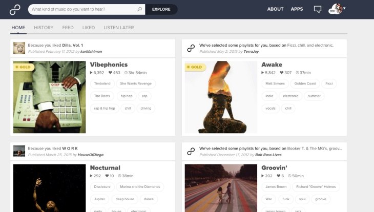
We’re excited to share with you today the beta launch of our smarter, redesigned website that suggests playlists based on your listening preferences. Now, when you log-in, you’ll be taken to your new, Facebook-like, home feed that surfaces 8tracks’ depth of content. The feed provides personalized recommendations for playlists that draw from a variety of inputs, including your expressed preferences – tag searches or selections, liking a playlist or track – and social cues, such as the other community members that you follow.
The new design also includes a greater emphasis on our community of unique DJs with their profile images assigned to each playlist in search results and in the playlist description:

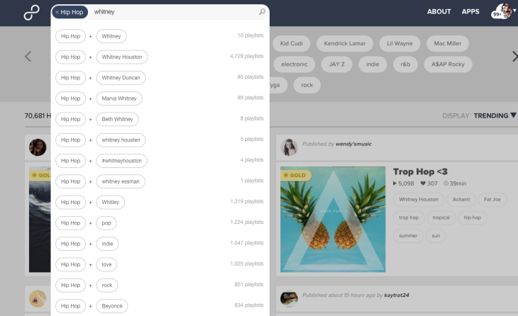
Additionally, we’ve simplified search and explore, providing a unified tag design around activity, mood, genre, or artist:
We’re going to unroll the beta website over the next few weeks. A limited number of listeners will be presented the opportunity to try the new beta site as of today. Within a month, 8tracks will extend the option to the larger community to toggle between the two versions, before making a final switch to the latest one.

Woot! Can’t wait to try the new version. 8tracks always so slick! Let’s hope that recommendation system gets slicker 🙂
LikeLike
Looks good! One question: will it have a more powerful search, as in: “I only want to see playlists that have more than 30 songs” or “I only want to see playlists that have more than 500 plays”
With the first one I am looking for an easy way to find a nice playlist, that I can just turn on and forget about while working or doing stuff around the house 🙂
No matter what, it looks great already!
LikeLike
NOOOOOOOOOOOOOOOOOOOOOO
This is such terrible news! I tried the beta version today and within a couple minutes of browsing the new features I experienced a mild panic attack and had to switch back to the ‘old’ version immediately. My heart sank with the realization of how much will be lost when the change is forced on us.
I’m currently taking screen captures of my page, so that I can look at these later and remember the 8tracks of old. My lovely profile page, so carefully curated over the years, will soon be reduced to a streamlined, impersonal overview; a generic interface utterly devoid of soul. There is no artistry to these modern formats! Everything about them is utilitarian and empty, unsympathetic to individual expression. The ‘individual’ is rapidly being marginalized in favor of the hivemind, consolidated further and further until there’s barely any differentiation from one to the next.
Remember what a ‘mix tape’ used to be? What it used to mean? This site originated from that concept. The mix tape was about personal expression — it was *intimate*. There are plenty of people still adhering to this notion on this website, creating playlists that *say something* — something that can only be heard in the transition between the songs. Meanwhile, though, our inboxes are assaulted with site bulletins encouraging us to “make a workout mix!” to be churned out simultaneously with everyone else’s ‘workout mix,’ in the spirit of the ‘community’! I mean, if you want to post ‘workout mixes,’ go for it, that’s your business (nothing wrong with that). What’s ‘wrong’ is this pervasive mentality; this divergence from the soul of the original concept into the soulless, utilitarian paradigm that is spreading like a cancer throughout all of our creative systems and which 8tracks will only perpetuate with its launch of this clinical new beta version. Catering to the iPhone generation, because that’s just ‘how it’s done’ these days.
I don’t know. Maybe I’m just moaning into the void at this point. The world is changing too fast and too recklessly, and everyone is forgetting who they are as they try to keep up to speed. Whirlwind adaptation. Sacrificing substance for convenience. Depraved New World. My objections are pointless.
LikeLiked by 1 person
Thanks Peter! Your suggestion is great, and certainly something we’ll bring to the table to discuss for future feature additions. At the moment, the explore doesn’t allow you to select in that capacity, however I’d suggest — for now– curating those long listening experiences by building collections. 🙂
LikeLike
I’ve been using the beta 8tracks interface for a couple of days now (the new one) and, like all updates, it has it’s pros and cons. For one, the headers somehow always look empty and unbalanced because one side always has the cover art but the other has a bunch of empty space, especially on the playlists that only have four or five tags. This wouldn’t have bothered me so much if the header colours were something other than the ugly grey’s that clashed with the feel of the website and the playlist. If I want to listen to a happy playlist about dancing, I don’t want to be faced with a navy background that sucks the joy out of life. Seems a bit counterproductive to what the playlist is trying to convey.
Most of my dissatisfaction with the new 8tracks look seems to stem from those headers. Letting users pick the background for their playlists (as well as for their profile background) may get rid of those grey’s/navy blues that don’t match the feel of the playlist. Or blurring the colours of the playlist art. And maybe putting the description on the right side where there currently is a lot of empty space, to try and fill it a little.
As for the pros, everything below the headers is spot on. The new way to advertise playlists and collections looks really sleek and modern, the use of the whole width of the page to display said playlists looks superb, and the toggle between playlists/liked/collections/favorite tracks on user pages is spectacular, bringing organization and aesthetic.
LikeLike
I’ve tried out the beta. I find it difficult to use, process, and view. Currently the site is very streamlined and easily accessible. Pages are not crowded with information, my profile is simple, and when I want to search through my “liked” playlists, I can view them as a list on different pages, with “next page” at the bottom.
The beta version has infinite scroll, which might look nice at first, but is a nightmare for, say, someone like me trying to go back to playlists I liked last year which I know are on page 12 of my “likes,” but is now 30 minutes of infinite scrolling away in the beta version.
The infinite scroll is also on the “search playlists” option on the beta site. Instead of working through every playlist for a specific subject I’m interested in, as I can with the “next page … page 1/6″ option I have on the current site, with the beta it’s an infinite scroll.
I really love this site, I visit several times a day and recommend the site to my friends. I can understand why some of the site updates are being made, but most seem cosmetic and random, rather than to aid in site functionality for your users. Some of the “updates” make using the site more difficult, rather than easier. You have a great format for this site already, and some of these updated features make using the site a chore and a frustration rather than an easy and fun way to listen to music.
Please, please, PLEASE when it comes time to update the site, add an option of “page view” or “list view” or something beside the “infinite scroll” which is currently the only option with the beta site. Currently, there are two options to view playlists: square boxes of album art, or a list view of the album art with accompanying text. The beta version lacks that option, which I think is a detriment and a mistake. Adding the option of a list view and page view to the new site would help your userbase migrate to the new site and make viewing the site feel more customized.
I love this site but I don’t think I can use the beta version. Please, I beg you, consider a list view option and a page view/some other option besides infinite scroll.
LikeLiked by 1 person
I agree with AuntZelda about the loathsome ‘infinite scroll’ — this function always slows down my computer often to the point of freezing it. I’ve recently had to cancel my netflix subscription because their new website kept freezing when I tried to browse, so I gave up trying to use the site. I’m not going to bother browsing long collections on 8tracks if I have to infinite scroll through them.
LikeLike
I hate it. It’s horrible. Please go back to the old one!
LikeLike
Nothing works? I can’t skip songs, pause song, etc.
The new layout also looks terrible unless you were intentionally going for shitty-powerpoint-slide-thrown-together-the-night-before-by-a-middle-school-boy chic. In which case, you nailed it.
LikeLike
Seriously, this update is making me not want to use this site anymore, which would be a real shame. It’s just not doing anything for me, other than irritating me with its aesthetic and cramped design. NO THANKS.
LikeLike
Okay, so. I normally don’t do this. I normally nurse my anger and frustrations, have vehement conversations with my friends about it, and move on. I don’t like sounding mean, and I don’t like feeling like I’m attacking someone. But I am so pissed off right now, and I have a lot to say. So.
I honestly hate the new 8tracks update. With everything so large and spaced out (I can only see two playlists at a time before I have to scroll!) and no option for any sort of list, detail, or condensed view, I’m overwhelmed and less than impressed.
I also agree with Kelly above — the new update has caused users to lose their own sense of personality or even aesthetic. In the old design, when viewing a profile, the fact that all of the user’s mixes were next to each other, in a condensed view and easy to see and compare all at once, gave the onlooker a feel for the user’s style. Now, the interface feels completely impersonal — I want my playlists to speak for themselves when someone looks at my profile, but whereas one used to be able to see all of my playlists at once, now they can only see ~two at a time before they have to scroll.
Furthermore, the old interface allowed for a listener, when on the page of a certain mix, to look to the right and view the poster’s four most recent mixes. This was a nice little advertisement for the poster, kind of like “hey! This is the other stuff I have. These are the other posts I do. Check ’em out!”. I found a lot of great mixes that way — just because something caught my eye. With the new interface, however, it only shows one other mix by the poster. What’s the point of that? I want listeners to see a cross section of my mixes and be drawn to it, and the odds of that happening if they see only one other playlist are next to nothing.
But wait, there’s more! Annotations on songs used to pop up right above the ‘currently playing’ bar. They were small and out of the way, but could be x’ed out if you really didn’t like them. Now, however, they don’t show up there at all; they only show up underneath the song on the list view of what has played in the mix so far. So, not only do listeners have to stay on the playlist’s homepage to see the annotations, they have to physically scroll and look for them. I have a few mixes where the annotations are integral to and practically the whole point of the mix — without them, the listener doesn’t get the full effect, and playlist might not even make sense. With the update, new listeners might not even know I have annotations, because you can’t see them in the list view unless you — get this — physically scroll down. Noticing a trend?
But I’m not done yet. Artist info for songs is popping up more than ever, except with the new update, there is no way to x them out. They fade eventually, but if you hover over them with your mouse, even by accident, they stick around longer. If they were small and unobtrusive, I might let it go. But they’re not. They’re huge. Now, I have a 13-inch screen. Not huge, but not abnormally small, especially for a laptop. Between the bar at the top of the page, the ‘currently playing’ bar (both of which, if I’m not mistaken, slightly larger than they used to be), and the artist info bar, almost HALF of my page is gone. And you know what that means! Yep, you guessed it. If I want to see literally anything on the page, MORE EXCESSIVE SCROLLING!
Don’t even get me started on the infinite scroll feature. Although I think the comments before me pretty much covered it, I’ll reiterate: it sucks. I get that some people like it, but at least give us an option to disable it?
Also, literally everything is bigger EXCEPT mix cover art, which is now smaller than it used to be. But isn’t that half the point of this whole playlist thing? To HAVE cover art? To curate playlists and cover art TOGETHER? Why are we downplaying it?
Then, we have the home page. The home page used to consist of all sorts of things: recommended playlists, history, favorites, feed, listen later, etc. On the home page was a sample of mixes in each category, and if you wanted to see more you could click and go to the category’s individual page. It was nice — you could see more of what you wanted, and could just scroll past was disinterested you. Now the home page consists solely of recommended playlists. I’m sure some people like this feature, but it is of very little use to me. Why make it the entire home page? I was never drawn to it, but I WAS drawn to mixes that came up on my feed. I was drawn to playlists I forgot about, but saw on my listen later. I was drawn to mixes I had heard before, just because I saw it in my favorites and wanted to listen again. Doesn’t 8tracks want people listening to its mixes? Why set it up like this, where it’s less likely they’ll see one that catches their eye? None of the different categories are on the same page; you have to purposefully click all over the place to see each one.
Oh, and one more: the tags. What the poster tags their mix as and which artists 8tracks auto-tags it as used to be separate. Now they just come one after another. I liked that listeners used to be able to tell “oh, the op tagged this as a fanmix, and 8tracks tagged it with Lana del Rey! Cool!”. There used to be a definitive difference between man and computer, but now that line is blurred. It may just be me getting touchy, but mashing the two together makes it feel like you’re putting words in my mouth, and it makes me uncomfortable. Sometimes people put entire descriptive sentences in the tags, giving the listener a feel for both the poster and for what the mix will be like; I don’t want that mixed with the computer-generated description of “Mumford and Sons”.
You sprung so many changes on us at once, 8tracks. If you’d maybe let us down easy, done some at a time, I might not be so frustrated.
TL;DR: everything is huge and spread out, to the point that you can’t see anything without scrolling; this, among other things, has led to the depersonalization of profiles; annotations might as well be invisible at this point; everything is huge and requires scrolling; non-infinite scroll and any sort of list or condensed view is no longer an option; cover art is downplayed; what home page?; EVERYTHING IS HUGE AND REQUIRES SCROLLING.
I am highly discouraged and disappointed in 8tracks at the moment. You bragged at the beginning of this blog post about how the new interface is, and I quote, “Facebook-like”. Okay, that’s cool and all, but I don’t want Facebook. I want 8tracks. This isn’t a social networking site. It’s a music site. I get that Facebook is cool and big and successful, but it’s a whole different genre. Sure, there was a social network aspect to 8tracks — but in trying to become more like Facebook, you actually kind of killed it and made your site more impersonal. Oh, the irony.
So, in conclusion: the old interface wasn’t perfect, but I would chop off my left arm to get it back.
(Oh, and also, the “back to old site” button is still there, even though going back isn’t an option anymore. I clicked and was highly disappointed. Might want to fix that.)
LikeLiked by 1 person
I agree so hard with everything Sarah said above! Especially what she said about the new mixed tags (user inputs mixed with auto-generated tags), i.e. “mashing the two together makes it feel like you’re putting words in my mouth, and it makes me uncomfortable.” YES. SO UNCOMFORTABLE.
There’s so many reasons to hate the new layout. @Staff — PLEASE review these complaints and figure out a better way. The new layout just isn’t cutting it. Until some serious improvements have been made, I have no interest in using 8tracks anymore (after SEVEN YEARS of loving this site!).
PS: Facebook sucks! Nobody likes facebook; all the cool kids have abandoned facebook by now. There’s nobody left on there but grandparents, lame cousins and the kind of people who actually care about their high school reunions. Why would you want to emulate it??
LikeLike
I had to flip back to the old one because I couldn’t figure out where the pause button was. I like to listen at work, so getting rid of an easily located pause button is a bit of a dealbreaker for me…
LikeLike
I agree 1000% with Sarah, above, and several other comments. Even though most of it’s been said already, I’m going to say it again because it upsets me.
My favourite thing about 8tracks was the layout of the profiles and how the playlists were displayed with just the cover art, side by side and up and down, so you could immediately get the ‘vibe’ of each DJ with a quick glance over their page. It was like a work of art in itself and it meant I took great care in choosing the perfect image for each playlist because it felt like a big deal – it was going to be a part of the beautiful patchwork I was making that represented my musical personality, to myself and to visitors of my page. Simply, I liked looking at it and I hoped others did too. It always felt like I was making a proper mixtape, something special that had a little of my soul in to give to others. Likewise, I loved how you could immediately see a users most recent likes and the playlists added to their collections, all on one page and in a way in which you could click immediately on anything that caught your eye and go straight to that playlist. Now you have taken that away. It seems you no longer get an overview of anything anymore – anything that took one click before now takes three and you’ve removed the enjoyment of how I used the site. I don’t want everything to be separate and I don’t need to see all of each thing in one go by scrolling, scrolling, scrolling – I want an overview that shows me who someone is and what sort of thing I’ll find if I choose to look further into their likes, or a certain collection, or their older playlists. You say you’ve made it easier to find new playlists but all you’ve done is take away all the surprising ways I used to enjoy discovering playlists and turn the homepage into an endless, soulless spiel of anything you think I might like, as if I want to scroll endlessly in search of something I used to find without trying. Like many others, I can’t stand the endless scrolling the new site entails. It becomes mindless and boring. I used to feel I could get lost in the 8tracks world, going from one thing that caught my eye to the next and enjoying the journey. Now I feel like I can’t find a way in and I don’t really want to. Every page looks the same. Full but at the same time blank and empty.
Onto the homepage: it’s just an endless of spiel of the same thing. I liked how, before, it had a bit of everything. I loved how, at the top of the page, I could see playlists liked and posted by anyone I was following. Without having to seek this out, I would see things that grabbed my attention which would otherwise have slipped past me. I liked how you could see a selection of featured, staff picks, suggestions, likes and your own playlists all on one page without going anywhere. If you wanted to see more of anything, you could click the category. It was good. It didn’t need changing. Now that everything is separate, if I continue using the site at all I probably won’t ever bother clicking the other headers because I’ll forget and it’s a waste of time. I’ll miss all those gems that used to catch my eye and spark my interest without being looked for. I also won’t bother scrolling down and down in search of something new because, quite simply, it’s boring. I was excited recently because I entered a playlist into last months festival theme and it was featured this month on the first part of the themed category section on the homepage so everyone could see it and it was getting a lot of likes – because, you guessed it, it was there to naturally catch the eye of anyone who happened to see it. Now there doesn’t seem to be a place for this at all. There is far less opportunity for natural exposure and discovery.
One thing I just don’t understand the motivation for at all is the fact that, when listening to someone’s playlist, you can now see only one other playlist by them on the right hand side. As has been said by others, I loved how you could see a selection of their other playlists before. It was another way to get the ‘vibe’ of the DJ without having to search anything out and I also discovered a lot of great playlists this way that grabbed my attention. Why limit this to one playlist that is clearly not going to be a full representation of the DJ and is much less likely to get traffic to their page and their other playlists? You’re not doing us any favours here. It didn’t matter that you couldn’t see the playlist information and description before, either on the profile page or on the right hand side of the page, unless you hovered over it or clicked on it. The art of 8tracks before was in choosing an image that spoke for itself and explained the playlist without words. That’s what made it really feel like a proper mixtape – which, if I’m not mistaken, was the idea behind and the essence of 8tracks. Well now that is gone.
You state you wanted to make it more about the DJs. It was already enough about the DJs. The fact that their personality and their soul was displayed clearly and vividly on their profile pages to share with others was enough. As stated by others, this is not a social networking site at its core and shouldn’t be made to look like one. It is about sharing the music. Now, in trying to make it more about the DJs and making it ‘Facebook-like’, you have consequently made it about nothing, because the DJs profile pages no longer say anything about them. They’re lifeless. Honestly, I don’t particularly like how Facebook looks anyway and it baffles me why you would want to emulate it when you had something so much better and so different to anything else. It shouldn’t even be comparable to Facebook because it’s not the same thing at all. One of my most loathed aesthetic concepts is the ‘clinical’ and this is now what you have become. Why does everything have to be updated to be modern and sleek? If it ain’t broke, don’t fix it. I’m sorry to say that, in trying to conform to this idea, you are no longer special and you’ve lost your original and unique idea.
I hate it, I really really hate. In one word it is perfectly summarised by ‘soulless’. It does’t excite me anymore, it just makes me want to cry. I may continue using it for a while because I have a lot of mixes saved in my ‘to listen to’ collection but I very much doubt that I’ll bother to contribute to the site by publishing anymore mixes and I have no doubt that I will eventually abandon it if it doesn’t regain some of it’s soul from the blackhole you consigned it to. I am not suggesting that you never make any changes but, in my opinion, you have changed all the wrong things in all the wrong ways. To add insult to injury, the ‘back to old site’ link that I tried to escape to 5 minutes after surveying the ‘improvements’ does not work for me so I’m unable to savour the 8tracks golden age while I still can. I feel like I’ve lost something great I’ll never get back. So thanks 8tracks. You’ve made me sad.
LikeLiked by 1 person
As much as I want to love this new update and support it, I find myself unable to after actually testing the beta. Others have put it in better words than I have, so my response won’t be long.
I’m sure many agree with me when I say the layout looks like a mobile layout. And while this is all fine, those of us who use your site on computer probably do it for a reason. And even that wouldn’t be a problem per se, but the bigger your screen is, the bigger everything else looks as well. It eats away functionality and looks awfully attacking when you open your profile page just to get greeted by your avatar, way bigger than any of the other images on your page.
Honestly, my only true complaint is the enormous size of everything. Large images make me feel nervous, and I know many others share the same kind of irrational discomfort with me. Not only would smaller track covers and the like save space but would also make sure your userbase won’t leave simply because they find the layout uncomfortable to look at. If you want large, mobile apps are already a thing that exists.
As a sidenote, just like some of the other posters, I can’t return to the old site either.
LikeLiked by 1 person
Just to add one positive note to my feedback: the playlist stats are great. They give visibility on precisely what’s going on and when you’re getting more plays/likes over time, even how much of your playlist is being listened to and which songs are skipped – information that we’ve never been able to see gathered before.
Having used the new site for some time today I also have to add one more negative: the ads that now appear on the right hand side every now and again don’t appear to be mutable once they’ve started. Not great when you’re trying to listen to music! Unfortunately the negatives still far outweigh the positives and I’ve yet to decide whether I’ll continue using in the long run. If I do, it’s with rather a heavy heart.
LikeLiked by 1 person
Hey @Sophie, thank you for the feedback. An ad not being mute automatically is a bug we want to address ASAP, since that shouldn’t be happening. Can you email us at web_support[at]8tracks the next time you see the ad with a screenshot of the ad?
LikeLike
i agree with many of the other comments, i’m not a big fan of the majority of the new site design either. i love the new player bar but that’s about it honestly. the profile, mixes and liked playlist pages are just too big and overwhelming. it was much more convenient (for me at least) seeing smaller versions of playlists and hovering over them. there is an option “back to old site” but it doesn’t let me revert. if it’s possible since reactions are mixed for the update, maybe fix and keep the option to revert permanent so people can use whichever version they prefer?
LikeLike
What I find most frustrating about this whole thing is the title of this blog.
INTRODUCING WEB 4.0 – A SMARTER WEB EXPERIENCE TO HELP YOU BETTER DISCOVER PLAYLISTS YOU’LL LOVE
Seriously, how can you title your announcement like this, when the logarithm you’re using for the new home feed is turning up mostly playlists that are either diamond, gold, or playlists I’ve already listened to, and often have either liked, or dismissed as in not interested. Seriously if you’re bragging about a new engine that’ll make it easier to find NEW content, I at least expect there to be actual content I’m interested in.
I’ve already explained my objections to the new design choices, and the lacking functionality in the forums, but I wasn’t aware of this blogpost, and it made me so frustrated, because I cannot help but wonder if the people responsible for this development actually in fact use 8tracks.
LikeLike
Hello hello hello beautiful and generous 8tracks people, you have been with me since 2010 every day of my life and made me immensely happy. As every day, I went to your web site, today, and because I trust in you, I tried the new interface you proposed, but… with all my heart I prefer the old site, I feel it more organized. I press the button “get back to the old site” and don’t do nothing, and I can’t go back Auxilioooo !!! : – (
PS: please apologize me, for going to google traslate, my English is very limited. thanks thanks thanks you infinitely for your priceless presence in my life.
with all my love,
maríat
LikeLike
The new layout of this website is probably the ugliest thing ive ever seen. One of the best things about this website was that the cover art really popped i guess. The old layout was unique to this website. Now you guys are trying to copy itunes or something. Please put the old style back
LikeLike
Hey 8tracks,
I love this website. I tell everyone how I use the website for playlists and is the only way I discover and listen to music. No Spotify. No more Pandora. Just 8tracks. But this new layout? Oh goodness. Just because it’s trendy, doesn’t mean it’s functional. I agree 100% with all the negative feedback. Just one look at the homepage gives me anxiety. Everything so large is just too much for my eyes to handle on my laptop computer. It’s fine for mobile because you already can take in only so much. But all at once? No. You guys sacrificed usability for looks. I sincerely hope you guys will address us who have taken the time to give our constructive criticism and heartbreak. Please put this back in beta while you guys address some issues. I need the old layout. We need the old layout. Please.
LikeLiked by 1 person
@Angela Did you try shrinking the screen size? If you reduce it to 70 or 80% you’ll get three playlists per result line which should hopefully help!
LikeLike
It’s not okay to expect users to have to use the zoom function on their browser to make your website viewable comfortably, though. Please, take the hint, really take to heart and act on the feedback given, and if you think 70 or 80% is going to be a good reduction to suggest people use… do it yourself! Give us back a functional site with some soul to it, not this hot mess. Please. Don’t give away everything that made this site fun to use in favour of being yet another website with an atrocious dime-a-dozen layout that makes our eyes hurt.
LikeLiked by 1 person
Hey, guys, another disgruntled fan here. I’m not gonna tell how uncomfortable the experience with the new layout is, because I think you can guess it by all those complaints. It’s a pity you didn’t try to change a bit the old layout and went for a completely new look. Still, I don’t think you’ll change it back, so I just wanted to ask for some much needed functions that are gone:
1) presets. I really liked the fact that I could follow a specific tag! Where did that go? Is it hidden somewhere? If not, it would be great if you brought it back. The things that you recommend me are not the same. They are based on different factors, everything is mixed up and generally a mess.
2) all mixes made by the person whose mix I’m listening to. That was also very useful, I loved to look at other stuff the person has made and it was just so much easier to have it all on the side, in neat rows.
I hope you’ll keep working on the new layout so it would be more functional in the future 🙂
LikeLike
Can we switch back to the original format. I’m not fond of this.
LikeLike
Interesting that new blog posts don’t allow comments now that 8tracks is trying to attract investors. Also, why are the forums down?
LikeLike
I have noticed you don’t monetize your site, don’t waste your
traffic, you can earn additional bucks every month because you’ve
got high quality content. If you want to know how to make extra bucks,
search for: Boorfe’s tips best adsense alternative
LikeLike